
Let me be honest with you for a second.
When I first started selling sublimation graphics on Etsy, I thought good design was enough. I thought if it looked beautiful on my screen, it would fly off the digital shelves. But pretty and profitable are two very different things — and learning the gap between them changed everything about the way I create.
If you are a crafter, a small business owner, or a creative trying to build real income from sublimation design, this guide is for you. Not fluff. Not filler. Just real talk about what actually works.
What Sublimation Buyers Are Really Looking For
Before you open a single design program, you need to understand something: sublimation buyers are not just shopping for art. They are shopping for transformation. They want to look at a tumbler, a shirt, or a tote bag and picture exactly how it is going to turn out. That means your job as a designer is not just to make something gorgeous. Your job is to make something they can see themselves using.
That might sound simple, but it changes everything about how you approach your designs.
Crafters and print-on-demand sellers are buying graphics to press onto physical products. They need files that are vibrant, clean, and built for the process. If your design looks muddy on a tumbler wrap or washes out on a white polyester shirt, it does not matter how stunning it looked in Canva. The design failed where it counts — in real life.
So the very first thing you need to commit to is creating with the end product in mind, always.
File Quality Is Non-Negotiable
I cannot stress this enough. Sublimation is an unforgiving process. Whatever is in your file is exactly what shows up on the product — every blurry edge, every off-color gradient, every misaligned element. There is no hiding from it.
Here is what your sublimation files need to be:
High Resolution. This means 300 DPI minimum, no exceptions. If you are designing tumbler wraps, some crafters prefer even higher because they are wrapping around a curved surface and any pixelation becomes very obvious. When in doubt, go bigger.
PNG with a Transparent Background. For most sublimation elements — clipart, individual graphic components, add-ons — PNG with transparency is your best friend. It gives the buyer flexibility to layer designs onto mock-up templates and use your graphics across multiple projects.
Color-Rich and Saturated. Sublimation prints tend to shift slightly in color depending on the product, the press settings, and the fabric blend. Designs that look rich and vivid on screen will often print with slightly more muted results on fabric. So when you are building your graphics, lean into bold, saturated colors. Do not be afraid of contrast. Washed-out pastel designs often disappoint crafters when they come off the press.
Sized Correctly for Common Products. Know your standard dimensions. A 20 oz skinny tumbler wrap is typically around 9.3 x 8.3 inches. A full sublimation shirt graphic is usually 11 x 11 to 12 x 12 inches. A seamless pattern tile should be at least 12 x 12 inches at 300 DPI. When you list a product on Etsy, include these dimensions clearly in your description. Crafters will thank you for it.
Themes That Actually Sell
Here is where a lot of designers go wrong: they create what they love instead of what the market is buying. And while I believe your personal style matters — it is what makes your shop stand out — you still need to meet buyers where they are.
The sublimation market has some evergreen categories that consistently perform well:
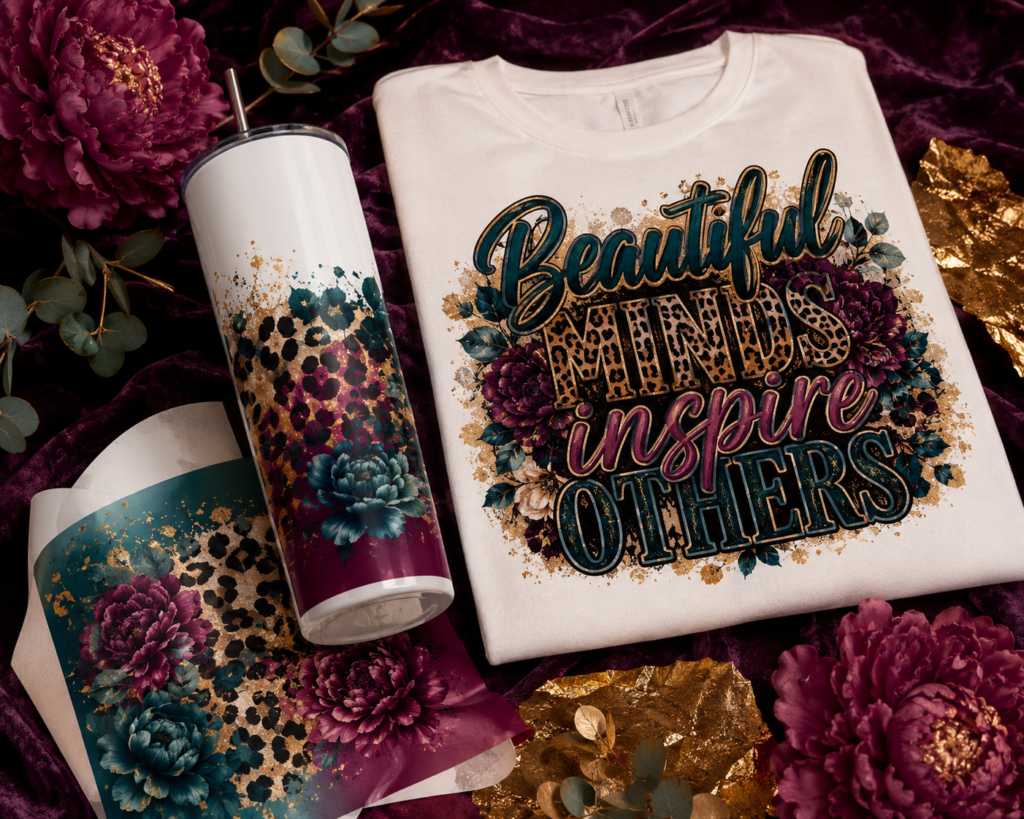
Inspirational and Empowerment Graphics. Women love to carry their motivation with them. Tumblers with “She believed she could so she did” or “Unbothered, Moisturized, Thriving” sell because they feel personal. Add a gorgeous floral or abstract background, make the typography bold and beautiful, and you have a winning design.
Seasonal and Holiday Designs. Christmas, Halloween, Thanksgiving, Valentine’s Day, summer — sublimation buyers go hard for seasonal content. The key is getting your designs listed 6 to 8 weeks before the holiday. By the time everyone is searching for Christmas tumbler wraps, the shops that listed in October are already dominating the search results.
Profession-Themed Graphics. Nurses, teachers, accountants, hairdressers — there is a whole world of buyers who want to rep their career with pride. A “Nurse Life” tumbler wrap with a clean medical-glam aesthetic? That moves. A “Best Teacher Ever” shirt graphic in a cute boho style? Also a consistent seller. Get specific with the professions and the designs will find their audience.
Leopard, Floral, and Pattern Seamless Designs. Seamless patterns are a sublimation crafter’s staple. They can be used as full tumbler backgrounds, pillow covers, tote bags — the versatility is unmatched. Leopard print never goes out of style. Neither do wildflowers. Combine them with a cheetah border or a distressed texture and you have something that looks expensive and custom.
Girl Trip, Birthday, and Celebration Themes. Friend groups buying matching tumblers for bachelorette parties, girls’ trips, and birthdays are a very real and very enthusiastic buying audience. Think glam, bold, coordinated. Cruise vibes, Vegas vibes, beach vibes. These designs get ordered in bulk because friends want sets, and sets mean multiple sales from one listing discovery.
The Design Details That Separate Good from Great
Let me talk about the little things that make a big difference, because this is where most designers either level up or stay stuck.
Typography is Everything. The font you choose tells buyers what kind of energy your design has before they even read the words. Serif fonts with elegant thin strokes feel luxe and high-end. Brush lettering feels handmade and personal. Bold block fonts feel powerful and confident. Mixing a script with a clean sans-serif is a classic combination that always looks polished. What you want to avoid is using the most overused fonts in the game — you know the ones — because your design will look like everyone else’s shop.
Color Palettes Should Feel Intentional. The best sublimation sellers are not just picking random colors. They are building cohesive palettes that feel like a whole vibe. When a buyer looks at your thumbnail, they should immediately feel something — warmth, luxury, playfulness, edge. Choose three to four colors maximum for most designs and let them work together instead of fighting for attention.
White Space Is Not Dead Space. Some designers pack every inch of a design because they think more = more value. But breathing room in a design is what makes the focal point pop. Give your main graphic or text room to command attention. The elements around it are support characters, not the main event.
Add a Texture or Background Element. Flat designs can feel lifeless. Adding a subtle watercolor wash, a distressed overlay, a soft gradient, or a light bokeh background gives your graphic depth. It makes it look less like clipart and more like a finished, professional design. Buyers notice the difference even if they cannot always name what they are seeing.
How to Mock It Up Before You List It
Your listing images make or break your Etsy sales. A stunning graphic buried under a boring screenshot will not convert. Period.
You need product mock-ups, and you need good ones.
There are plenty of places to find quality mock-ups — Creative Fabrica, Creative Market, and Etsy itself has mock-up sellers who specialize in sublimation products. Look for mock-ups that show realistic lighting, product texture, and multiple angles. A tumbler wrap mock-up that shows the design wrapped around a glossy white cup in natural light looks like a real product somebody made. That is what drives the “I need this” feeling in the buyer.
Use your design mock-ups as your main listing image and your first few secondary images. Then include a flat preview of the graphic itself so buyers can see the details clearly. If you are selling a bundle, show all the pieces laid out together so they can see the full value.
And always — always — include a size and file type reference image. It sounds boring, but buyers want that reassurance before they check out.
Pricing Your Sublimation Designs on Etsy
Underpricing is one of the most common mistakes new sellers make, and I want to gently push back on the idea that you have to price low to compete.
You are not competing on price. You are competing on value.
A well-designed, high-resolution sublimation graphic bundle with multiple coordinating designs, sized correctly, mock-upped beautifully, and listed with a clear and helpful description is worth real money to the buyer who needs it. They are not just buying a file. They are buying time they would have spent trying to create it themselves. They are buying confidence that the final product is going to look professional. They are buying your eye, your taste, and your work.
Single designs can start around $2 to $4 for simple graphics and go higher for detailed or seasonal work. Bundles of 5 to 10 coordinating designs should be priced accordingly — not discounted to the point that the individual value disappears. When you price too low, buyers sometimes question the quality before they even open the file. Price with confidence.
Building a Shop Identity That Gets Remembered
The Etsy market for sublimation graphics is not small. There are a lot of sellers. So the question is not just how do I make good designs — it is how do I make designs that look like mine.
Your shop should have a recognizable visual identity. That means your listing images should feel cohesive. Your colors, your mock-up style, your thumbnail layouts — they should all look like they belong to the same shop. When a buyer loves one of your designs and clicks over to your shop page, what they see should feel like a curated collection, not a random assortment.
Pick a style lane and own it. Maybe you are the shop known for dark and moody sublimation with jewel tones and metallic accents. Maybe you are all about soft boho florals with a natural color palette. Maybe you go full glam with bold color and luxe typography. Whatever it is, lean into it fully. Consistency builds trust, and trust builds repeat buyers.
One Last Thing
Building a shop that actually sells takes time. There is no magic file that goes viral overnight or a single product that changes everything immediately. What builds a real, sustainable Etsy income is consistent listing, intentional design, and understanding your buyers well enough that every new design feels like something they have been looking for.
You already have the creative ability. Now it is about pairing it with strategy.
Keep designing. Keep listing. Keep paying attention to what your buyers are telling you — through their reviews, their purchases, and even their questions. That feedback is gold.
Your designs deserve to be seen. And the buyers who need them are already searching.
Artistry Designz creates bold, feminine, AI-assisted digital designs for crafters and creative entrepreneurs. Browse our sublimation graphics, clipart bundles, and digital resources in the shop.