If your brand is giving “I made this at 11:47 p.m. with one eye open and a cup of cold coffee,” I have been there. Seriously. I’ve built so many cute little offers, graphics, and shop graphics from my kitchen table, and I know how fast a business can feel a little messy when the branding isn’t pulling its weight. The good news is that your brand does not need a fancy studio or a huge budget to look luxe. A few smart choices can make your online business feel polished, more high-end, and way more memorable.
Choose a tighter color story
If everything is bright, loud, and fighting for attention, the whole brand can start feeling chaotic. I love color, obviously, but luxe branding usually feels intentional. Pick a small set of colors and use them on repeat across your logo, social posts, product mockups, and Etsy graphics. In my own shop, I noticed the second I stopped using “every pretty color I own” and started sticking to a stronger palette, everything looked more expensive. Even if you love bold color, you can still do luxe. Think rich plum, soft blush, deep teal, warm gold, or even black and cream with one pop color. The magic is consistency.
Use better fonts, not more fonts
This one changed everything for me. So many creators use too many cute fonts, and I get it because Canva has a million tempting options. But luxe brands usually keep it clean. Pick one strong headline font and one simple body font, then use them everywhere. That alone can make your brand feel more grown up. I also like pairing a sleek serif with a clean sans serif because it gives that fancy-but-still-friendly feel. When I started being picky with typography, my designs stopped looking like random graphics and started looking like an actual brand.
Make your images feel styled, not stuffed
This is a big one for AI art, Canva graphics, product photos, and Pinterest pins. Luxe visuals usually have breathing room. They are not crammed full of clipart, stickers, shadows, glitter, and five different textures all at once. I love a colorful design moment, but I try to make sure every image has a clear focal point. If I am using AI art, I choose prompts that create rich lighting, smooth composition, and a polished mood. If I’m building something in Canva, I leave space around the text and use just enough decorative detail to make it feel intentional. Even a simple mockup can look expensive when the layout is clean.
A little honesty from me
I used to think “luxury” meant fancy materials or expensive branding kits. It does not. A lot of the time, it just means your business looks calm, clear, and thoughtfully made. That took me a while to learn because I loved adding all the things. Still do, honestly. But now I know when to stop.
If you want your online business to look more luxe, start with these three things: a tighter color story, stronger font choices, and cleaner visuals. That combination works for AI art creators, Canva sellers, Etsy shops, sublimation businesses, and honestly any creative side hustle that needs to look more polished fast.
If this helped, go read more related posts on the blog. I’ve got more AI art tips, Canva tricks, and creative biz ideas coming that I think you’re going to love.
If you want your brand to feel luxe and memorable, you do not need to make it look stiff or untouchable. You need a vibe people can feel the second they land on your page. That is what I always go for with Artistry Designz. Bold. Colorful. Feminine. A little extra in the best way. And honestly, that kind of brand presence is what helps crafters, Etsy sellers, and digital product creators stand out in a feed that is packed with lookalike content.
Brand Basics That Make People Stop Scrolling
A confident brand starts with a clear visual identity. I like to think about three things first: color, typography, and consistency. Pick colors that match your energy, not just what is trending. If you love plum, teal, gold, hot pink, or creamy neutrals, build around that. Then choose fonts that feel polished but still easy to read. One strong headline font and one simple body font can do so much more than a messy mix of five different styles.
If you make sublimation designs, printable art, clipart bundles, or resin jewelry promo graphics, your brand should feel the same across everything. That means your Etsy shop banners, Pinterest pins, Canva mockups, and social posts should all look like they belong together.
How I Use AI Art Without Losing My Style
AI art can be such a good helper when you know how to steer it. I use tools like Leonardo AI, Artistry.Ai , and ChatGPT image generation when I want quick concept art, bold backgrounds, or a new visual direction for a product launch. The trick is writing prompts that are specific. Instead of saying cute floral design, I say something like vibrant feminine floral illustration, rich color palette, luxe digital art texture, high detail, clean composition. That little shift changes everything.
I also test prompt variations before I commit. Sometimes the first result feels off, and that is normal. I have made plenty of images that looked pretty but did not fit the product at all. That happens. You adjust, refine, and keep going.
Canva and Product Presentation Matter More Than You Think
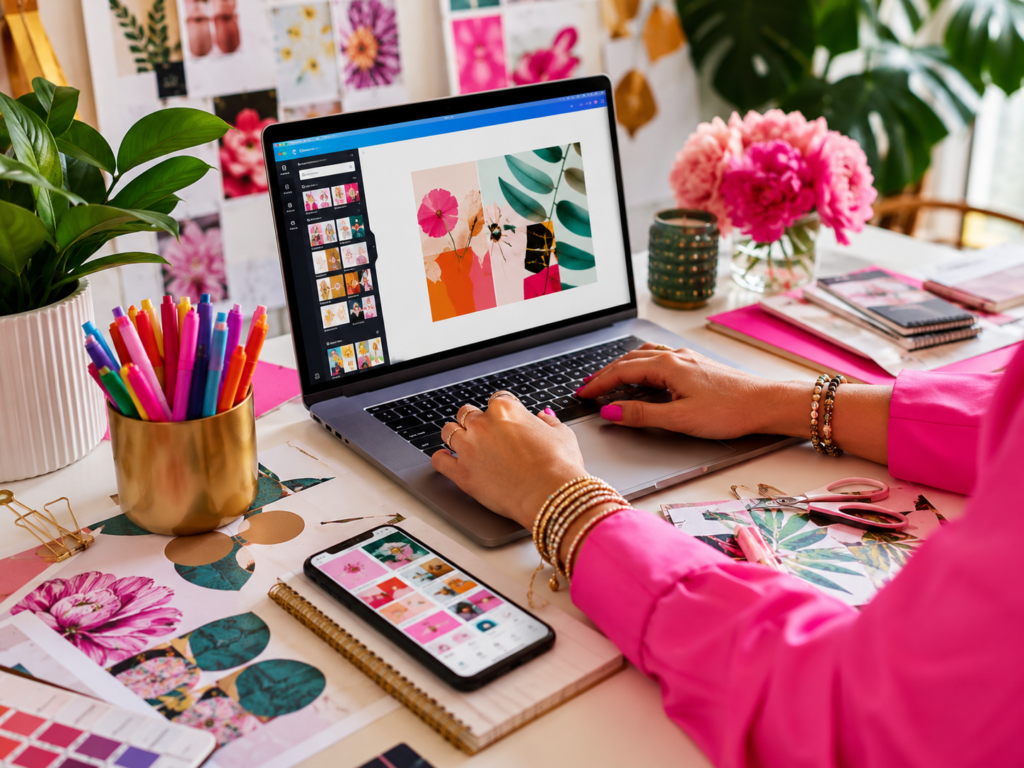
Canva is one of my favorite places to make a brand feel expensive without spending much. A clean mockup, strong spacing, and intentional typography can make a simple PNG bundle look high-end. I use Canva for Pinterest graphics, Etsy listings, lead magnets, and branded content that feels cohesive and polished.
If you sell digital products, print on demand, or sublimation designs, presentation is everything. A gorgeous file that is not shown well will still get ignored. Use bold flat lays, bright mockups, and lifestyle scenes with energy. People buy the feeling first.
The Small Details That Build Trust
This part matters so much. Your shop description, pin titles, listing photos, and product names all need to sound like they belong to the same confident brand. When your voice is clear and your visuals match, people trust you faster. That trust leads to clicks, saves, and sales.
I also think Pinterest is huge here. Pretty pins are great, but pins that clearly show what someone gets and why it matters are what actually bring traffic. If you are a seller, keep testing new pin styles, new keywords, and new product angles. That is where the magic starts showing up.
If you want your brand to feel luxe and memorable, do not try to be everything. Be known for your style. Be known for your color. Be known for that polished, creative energy people remember later.
If you want more real tips like this, go read more related posts on the blog. I have plenty more for AI art, Canva, Etsy, sublimation, and building a creative business that feels like you.